A Lens with a view to view 2
by Robert A F van de Voort
The mind knows
more than the eye and camera can see -Jerry Uelsman
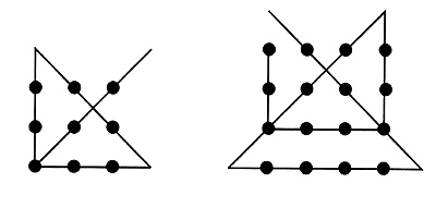
Remember in the last issue the blocks of points
at the end of my article? That exercise was meant to make you
think outside the box…click
here to view the last issue.
Visually we are stimulated into what we think
we see, all those points together seem to make a square, like
a block? If you were thinking in this linear fashion the answer
was not easy, for those free flowing right-brained photographers
the answer might be a bit easier. Let me start with the answers
on the connection lines of the square block lines.
Sometimes we tend to think too hard
while we take photographs or look, let your mind free flow and
see where you end up.
If we would let our right brain hemisphere free
and photograph for us we would see contrasts shapes, texture,
colour and other visual concepts like the Zone system and symbolic
interpretations would be easy to see. We could see music or movement
in our photographs.
Our left-brain hemisphere is doing the opposite,
it would inquire as to why things are and approach it in a very
intellectual way, it would see the Zone system as a number game,
and we would probably do a lot of "photography" on the
computer - very analytical. We would see a statement in a photograph.
It is strange that our left-hand and right-hand
contact in the opposite way to the brain hemispheres. In most
cases our right-hand is "instructed" by the left-hand
brain (now, what does that make us left-handed people like me…?)
and our left-hand is ruled or influenced by the right brain hemisphere.
Since I do like puns, or play with languages,
did you know that left in Latin is translated as sinister? And
what kind of connotations or word associations do you have with
the word "sinister" - the word evil or dark and threatening
comes to my mind. If you translate the word right into Latin it
becomes "dexter", the French equivalent is "adroit",
that means roughly clever and crafty. There are many references
to left-handed and right-handed as metaphors for evil and good.
Don't take this too much at heart…I wonder if left-handed
people had no problem connecting the dots in our previous article
compared to right-handed people…
I refer to a book "Drawing on the right side
of the brain", by Betty Edwards, in which she mentions an
exercise that could be useful to photographers.
It works like this: find a "simple"
photograph that you like.
Place it upside-down and try to draw it.
Do the same again but this time the picture is not upside-down.
Apparently if you look at both copies and see
the upside down copy it has a tendency to engage the right side
of the brain. Apparently it is said that some photographers believe
that looking at things upside-down like on the viewing screen
of a large format camera has a similar effect. Does that explain
my addiction to large format cameras?
I was digressing; I'm going back to what we see
through the viewfinder. When we see something that excites us
(in the viewfinder too!) our pupil can dilate. Emotionally there
tends to be a connection with the dilation of the pupil as well
as when there is less or more light. It is said that a dilated
pupil is more attractive or romantic then a contracted pupil.
Dinners by candle light…see the food, see the eyes…
Portrait photographers use this to best effect
by working in a darkened studio environment and use their electronic
flash to capture the wide-open dark dilated pupil. And as long
as your flash is not on the camera right above the lens, you will
not get a red eye effect. I prefer a F2 eye above a F16 eye, do
you?
When we make these fantastic photos, especially
in colour we often select colours we like or prefer to fit in
with surroundings or props. You know that we associate colours
with certain aspects of our existence? You probably know the obvious
ones like white. We can associate white with honesty, virginity
and purity, and mat black with death and sadness, glossy black
with classy stuff and formal clothing.
Here is a little list, (and by far from complete)
of associations that are probably lesser known.
· Purple: a high spiritual colour (top
chakra) sorrow, remorse
· Yellow: happiness, warmth, the sun, success, intellect
· Blue: masculine, commercial, erotic, timeless, cool,
inner peace
· Gold: wealth, rich, expensive, prosperous, delightful
· Red: passion, heat, vitality, creativity, blooming, embarrassed
· Silver: intuition, dreams
· Violet: transmutation, change
· Orange: pride, endurance, assertiveness
· Green: health, fertility, environment, New ZealandJ,
self-esteem
· Brown: earth, comfort, security, low emotional tone
As you can see there is a wide variety of expression permissible
if you consider that all these colours come in different intensities
or mixtures. Couple these colours with the props that you are
using and you can see that your emotional language of your photograph
is gaining momentum. The type of prop that you include in your
photograph will have certain significance. There is a definite
difference between an apple or a banana in a photograph used as
a prop - in a similar fashion there is a definite difference between
a dove and an eagle. Outdoors, you will find similar differences.
Water or trees as a backdrop will convey a total different feel
and impression.
Well this was my eye opener; enjoy the afterimage
of this article!
For feedback, express your view - contact me at hotshot@ihug.co.nz.
Related reading: Art and Visual Perception by
Rudolf Arnheim
Viewing you next time,
Robert A F van de Voort
A Lens With a View to View
Articles
1
| 2 | 3
About the author:
 Robert van de
Voort is a professional photographer and writer, with his headquarters
located on the North Island of New Zealand. Robert's professional
photographic career spans the course of over 20 years, with
work in stock, advertising, studio, digital photography and
much more! You can learn more about Robert and see examples
of his stunning work by visiting his website at www.AlbanyStudios.co.nz.
Robert van de
Voort is a professional photographer and writer, with his headquarters
located on the North Island of New Zealand. Robert's professional
photographic career spans the course of over 20 years, with
work in stock, advertising, studio, digital photography and
much more! You can learn more about Robert and see examples
of his stunning work by visiting his website at www.AlbanyStudios.co.nz.